Quentinvest As A Complete Buying (And Trading) System; No AI Bubble
November 27, 2025
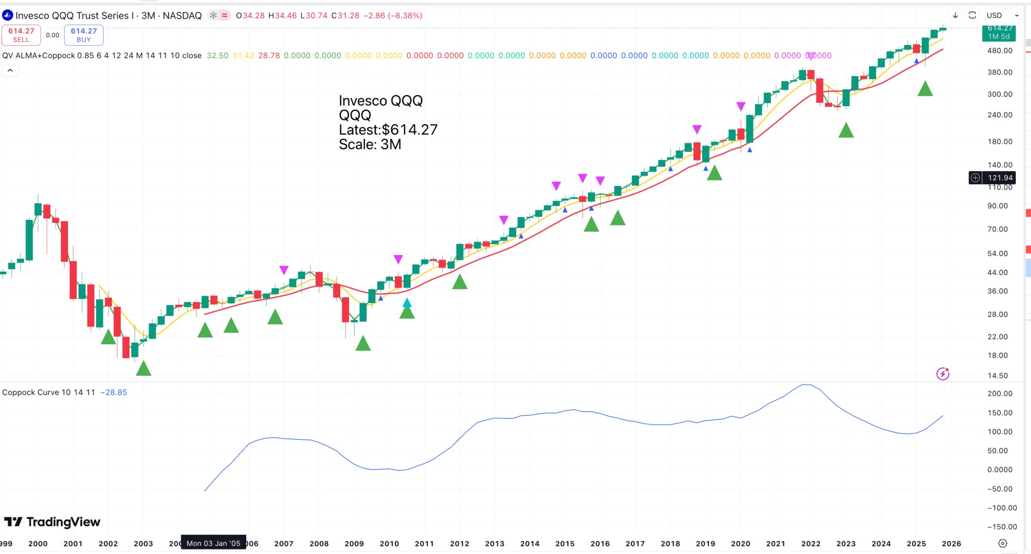
Above is a chart of QQQ, an ETF which tracks the Nasdaq 100. I have made each candlestick three months, so the chart is not too crowded with signals. I realise this is not the latest version of our presentation because the blue triangles, signifying Coppock buy signals, are so small. I will use our latest iteration of this chart next time. We are still on a learning curve.
The green triangles are moving average buy signals, the tiny dark blue triangles are Coppock buy signals (bigger light blue triangles come when Coppock turns higher from negative – see below), and the down-facing magenta triangles are Coppock sell signals (which work better on monthly charts).
QQQ is moving higher after a strong double whammy buy signal (moving averages plus Coppock).
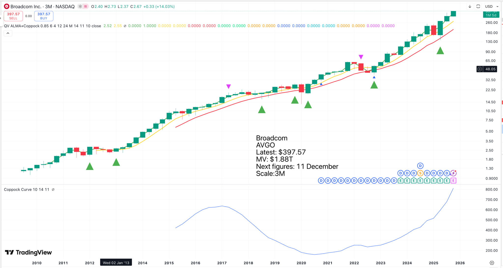
Broadcom (AVGO) has been one of the world’s great investments over the last 15 years. The QV buying/ trading system works as follows. It is a buying system if you plan never to sell, a trading system if you sell occasionally. Either strategy should deliver great results if the company delivers as hoped.
If you are buy and hold, then you can maximise gains by doing the following. Start with an initial purchase. Thereafter, buy on every moving average buy signal (green triangle), every Coppock buy signal (blue triangles), and every time the shares close the month at a new all-time high. Incredibly, there have been 47 buy signals since 2010. The shares are so strong that they keep giving buy signals.
In the case of Broadcom, the trading system makes little difference. You sell the shares whenever Coppock starts falling, as signalled by the down-facing magenta triangles. There have been two such sell signals, and they have made little difference to the overall performance. This is an insurance policy. You sell in case the shares might fall.
This is a monthly chart, which is which may be the most suitable if you plan to trade your shares. Trading is not so much about maximising gains as avoiding disasters. Also, remember that when you sell one share, this releases funds to buy another. The buying strategy is unchanged. Start with an initial purchase and add to your positions on buy signals (green, light blue and dark blue triangles).
In the trading strategy, you sell your entire holding every time there is a magenta down triangle. In effect, what you are doing is selling every time the rising trend loses momentum. A falling Coppock overrides all green triangle moving average buy signals.
In the chart above, you sold in July 2021 and bought in March 2023. Then you sell in July 2024 and buy in June 2025. Then there is a whiplash, which I would tend to disregard, so you are holding currently.
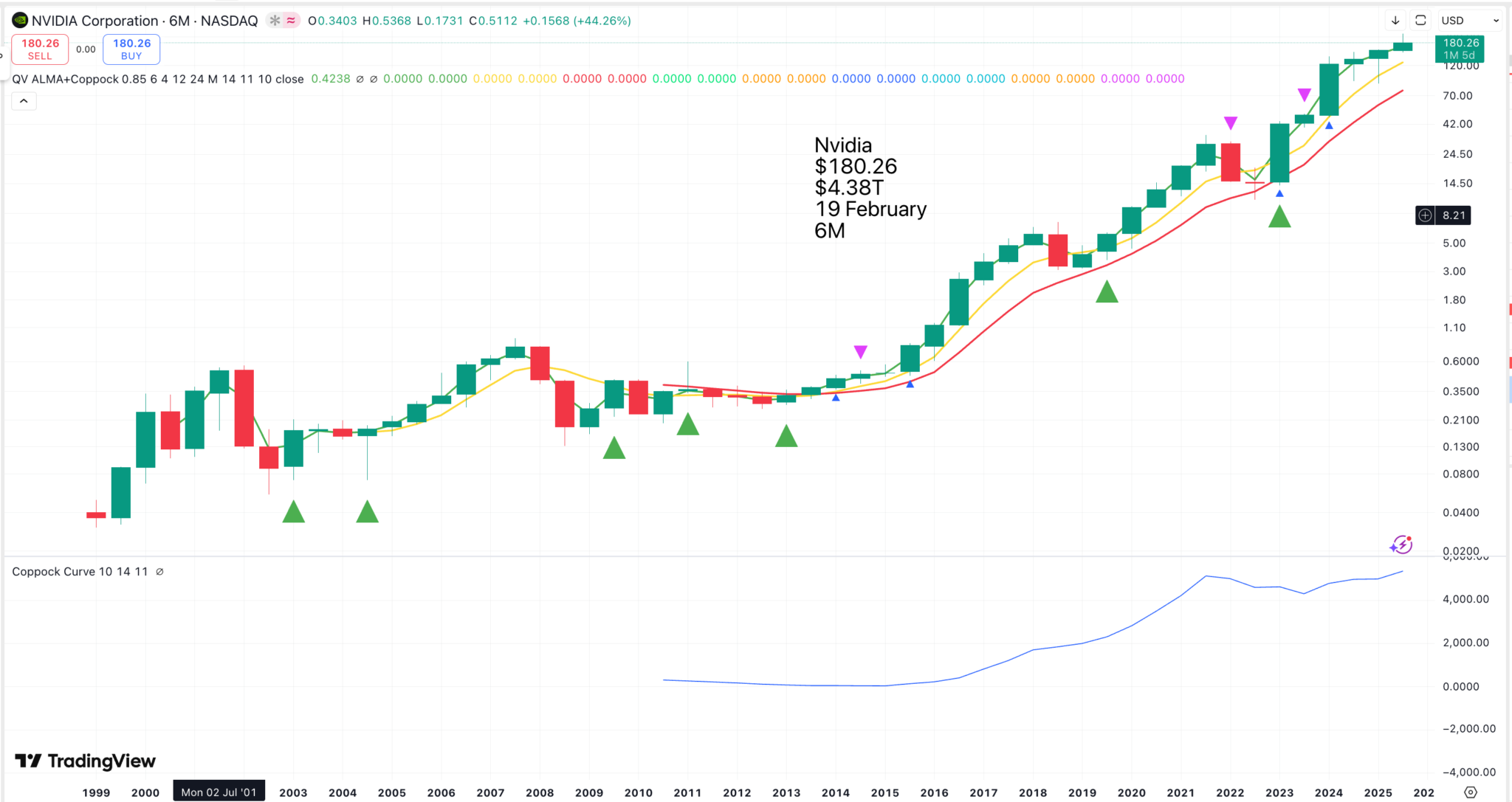
This is a 6m candlestick chart. Coppock only kicks in after 11 years, but it would have signalled the two massive downturns in the first decade of the new millennium. It signalled sell in 2022, which looks small on the chart, but peak to trough, 21-22, Nvidia lost two-thirds of its value, so not a bad time to stand aside.
The current message is bullish, and after the monumental breakout in 2015, buy and hold has been a great strategy with Nvidia. The AI bubble guys are going bananas, but I back Jensen Huang every day of the week.
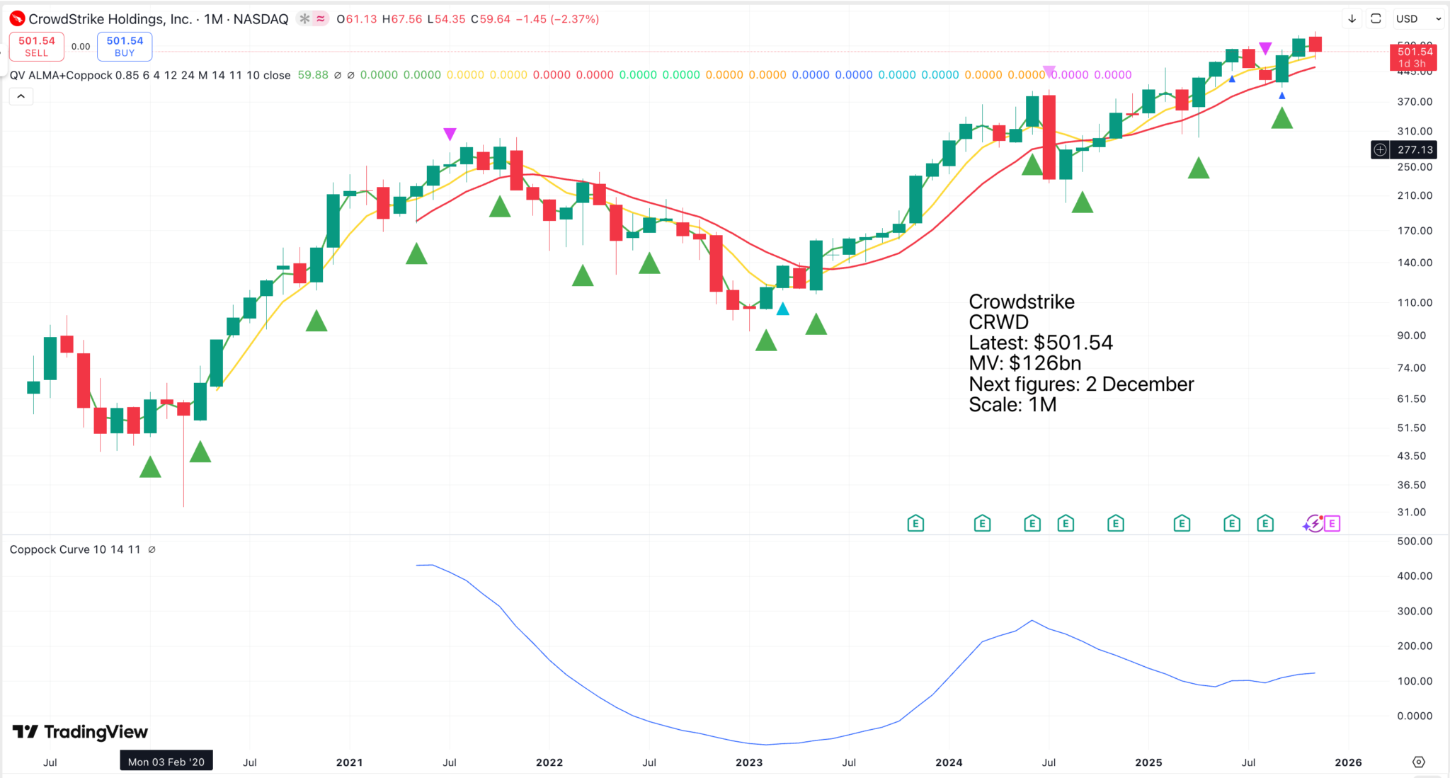
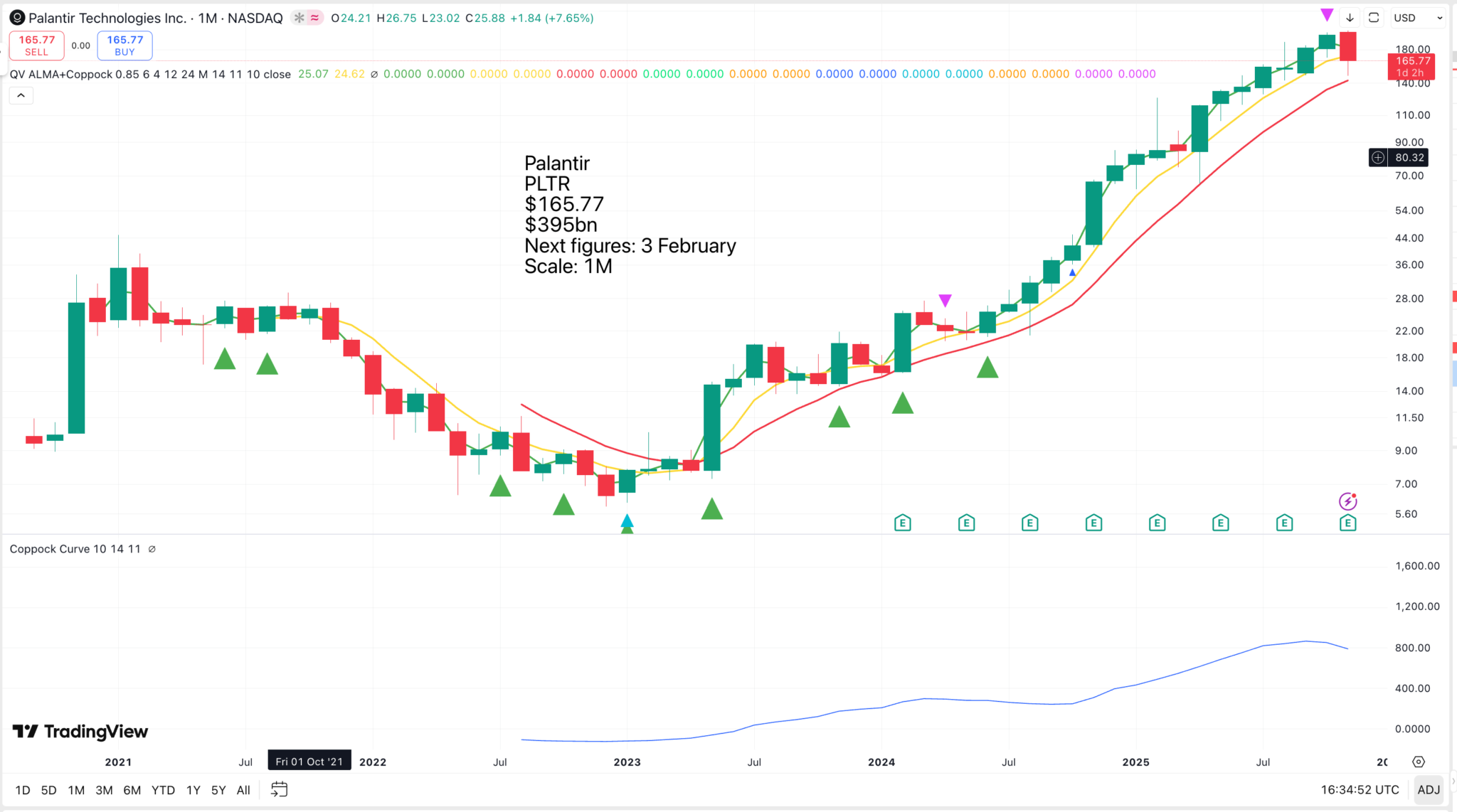
We have a Coppock sell signal on the Palantir chart. I remain a raging bull of Palantir on the world-beating fundamentals, but you could make a precautionary sale on the understanding that you buy when Coppock turns higher again, and no hard feelings if the shares are more expensive when you do.
Palantir is routinely described as the most expensive stock in history. OK, has there been a stock in history with such an opportunity? I am like Alex Karp, I can’t wait to dance over the bodies of the short-sellers and the value guys. May they eat crow!
Just read an excellent article explaining why we are not in a bubble.
Is the U.S. stock market currently in an AI bubble? My favorite indicator says no. If corporate executives thought that stock prices were too high, they’d be issuing equity. Instead, they’re repurchasing it, to the tune of $1T in the past year according to Morningstar.[1] That’s a trillion reasons to believe that we’re not in an AI bubble, at least not yet. I call issuance the Third Horseman of the Bubble Apocalypse, and right now, this horseman is nowhere in sight.
Firms are the smart money, and thus high aggregate net issuance would be a symptom that a bubble is occurring. In addition to being a symptom of bubbles, issuance is also a cure for bubbles. Bubbles don’t usually end until an increased supply of shares hits the market, either from existing firms or new firms. In 1999, for example, we saw more than 400 IPOs, and soon the market was overflowing with internet stocks, eventually pushing stock prices downward. But today, we see no similar IPO wave.
Graham (1973) wrote:
… most new issues are sold under “favorable market conditions” – which means favorable for the seller and consequently less favorable for the buyer.
Since we don’t see many new issues, I think today’s market conditions are relatively favorable to the buyer.
Historical bubbles
Let’s take a quick tour through history to see the connection between bubbles and issuance.
In 1720, during the South Sea Bubble, the South Sea Company issued equity in multiple waves of subscriptions. In addition, over 190 “bubble companies” (what we would now call IPOs) were founded in 1720, only four of which subsequently survived according to Chancellor (2000). He quotes the following account published in May 1720:
It is observed that many of these projects are so ridiculous and chimerical, that it is hard to tell which is most to be wondered at, the impudence of those that make the proposals, or the stupid folly of those that subscribe to them …
The British Bicycle Mania of the late 1890s featured a wave of capital flotation and more than 600 new firms created between 1895 and 1897, according to Quinn (2019), who quotes commentary that “cycle shares promise to become as inflated as the tyres.” Few of these new firms survived.
Next, the 1929 U.S. stock market bubble featured enormous issuance by both existing firms and new entrants. Graham and Dodd (1934) blame the underwriters, describing 1929 as:
a wholesale and disastrous relaxation of the standard of safety previously observed by the reputable houses of issue.
The Japan bubble of the late 1980s exhibited a wave of equity issuance that peaked along with equity prices in 1989, according to Goyal and Yamada (2004). Yamada and Takahashi (2015) show that the number of IPOs rose in the 1980s, peaking in 1991.
The U.S. tech-stock bubble had a tsunami of IPOs peaking in 2000. Evidence arising from subsequent legal action against investment banks showed that underwriters privately believed that these new issues were overpriced but nevertheless pushed them on an unsuspecting public.
Measuring aggregate net issuance
Welch and Goyal (2008) provide a simple way to compute the aggregate dollar net issuance for the U.S. stock market in month t:
Net_issuancet = Mcapt – Mcapt-1(1 + Rt)
Mcap is total market cap of all common stock and R is the ex-dividend market return (a.k.a. price return or capital gain return). This formula gives a holistic measure of all the money flowing in and out of the aggregate stock market. A positive number means the supply of shares has gone up; corporations are selling equity to external investors. A negative number means the supply of shares has gone down; corporations are buying from shareholders.
The formula captures all the different forms of issuance by existing firms (including stock offerings and executive compensation) as well as firms entering the market (by IPOs, de-SPACs, and direct listing) and exiting the market (being acquired or going private).[2] For example, Twitter had an IPO in November 2013 (positive issuance) and later went private in October 2022 (negative issuance).
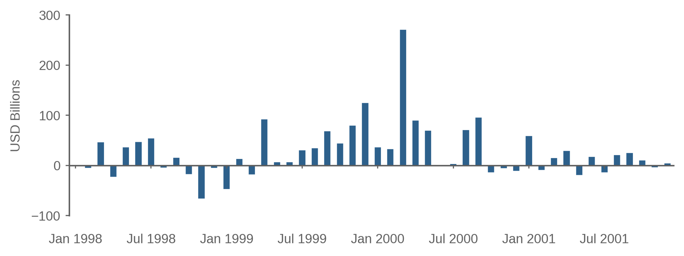
Figure 1 shows aggregate dollar net issuance during the tech-stock bubble. Issuance was mixed in 1998, but turned positive as prices rose in 1999, peaking in March 2000 at more than $250B. Then, as the bubble deflated, issuance turned negative, as firms mostly repurchased equity after mid-2001. So, even if you’d never heard of the tech-stock bubble, you’d be able to detect from Figure 1 that something happened in March 2000.
The formula is based on month-end market values, so it does not literally measure the funds raised by selling equity; instead, it measures the dollar value of shares ultimately entering the market. For example, IPOs are measured by month-end market capitalization, not by IPO proceeds. An alternative way to measure issuance is to carefully track all the shares involved in the IPO, including the initial proceeds and the shares subsequently sold by insiders. That approach, pursued by Ofek and Richardson (2003), shows a similar time pattern with total dollar issuance peaking in February 2000.
Mergers are another important way that firms issue equity, and there were many mergers during this period, as discussed by Lamont and Stein (2006). For example, the merger between AOL and Time Warner, a stock-for-stock transaction announced in 2000, was a fantastic deal for AOL shareholders and was a sign that AOL was overvalued. However, the merger had approximately zero impact on Figure 1, because the dollars flowed from one set of shareholders to another. Thus, while stock-financed mergers are an important signal at the firm level, they are not reflected in the aggregate net issuance.
Another way of thinking about Figure 1 is that it shows that the smart money (firms) was selling in 1999/2000. Therefore, we can infer that the dumb money (retail investors) must have been buying.
Figure 1: Dollar Net Issuance During the Tech-Stock Bubble
January 1998 to December 2002
Source: Acadian based on data from CRSP® (Center for Research in Security Prices. Graduate School of Business, The University of Chicago. Used with permission. All rights reserved. Crsp.uchicago.edu.) For illustrative purposes only.
How do bubbles end?
We can explain the tech-stock bubble using a simple supply and demand story. There were a bunch of optimists who wanted to buy internet stocks in 1999 and 2000. Their demand drove up share prices. In response, existing firms sold shares and various entrepreneurs created new firms that also sold shares. The issuance process was not instantaneous; for example, Pets.com was incorporated in February 1999 and didn’t go public until twelve months later. Eventually, enough shares were issued such that the optimists were satiated, and so share prices fell. That’s the story of Ofek and Richardson (2003), who say:
… to the extent that the magnitude of the volume in new sales pushes the marginal investor away from the optimistic clientele, prices should drop as this huge amount of capital works its way through the market.
Similarly, if the demand for avocado toast surges, the price of avocado toast will rise. It may take months or years for farmers to increase the supply of avocados, during which time the price of avocado toast will remain high. But as supply comes on line, avocado prices will fall.
Thus, part of the reason the tech-stock bubble deflated after March 2000 was the supply of new shares. There were likely other reasons as well: perhaps the optimists changed their minds, perhaps bad fundamental news arrived, or perhaps a “greater fool” mentality kicked in where everyone tried to sell their overpriced shares before it was too late.
If prices were too high in March 2000, why didn’t short sellers step in to profit by selling high? Shouldn’t we see rational speculators correct the mispricing, leaning against the wind and stabilizing prices?
In fact, we saw the opposite. Short interest decreased as the tech-stock bubble inflated. Simply put, short sellers fled the field of battle. Lamont and Stein (2004) find that:
… short-selling does not play a particularly helpful role in stabilizing the overall stock market.
The issuance we observe in 1999/2000 can be understood as a substitute for short selling, as both issuance and short selling are actions that increase the total supply of shares that can be purchased by optimists. However, the risks faced by short sellers and corporate issuers are different. If you shorted Cisco in 1999, you might have lost everything when Cisco’s price subsequently doubled.[3] That’s the relentless savagery of mark-to-market accounting. But when Cisco’s managers decided to issue shares in 1999 and subsequently Cisco’s price doubled, the managers did not suffer adverse consequences. As Lamont and Stein (2004) say:
A nonfinancial manager who issues equity … does so in the closed-end corporate form, and without being subject to mark-to-market accounting. Thus, if the market continues to go up, she will not record a loss, and she will certainly not be faced with the threat of liquidation.
Bubbles do not end due to the actions of short sellers or contrarians, most of whom are long gone by the time the bubble reaches its peak. They end, at least in part, due to issuance.
A century of issuance
To put net issuance into meaningful units, define scaled issuance as the trailing 12-month sum of net issuance, divided by the total capitalization of the market today.[4] If this number is +5%, for example, it means that 5% of the current market consists of shares that were issued in the past year.
Figure 2: 12-month Net Issuance as Percent of Market Cap
February 1927 to September 2025
Source: Acadian based on data from CRSP® (Center for Research in Security Prices. Graduate School of Business, The University of Chicago. Used with permission. All rights reserved. Crsp.uchicago.edu.) For illustrative purposes only.
Figure 2 shows scaled issuance over the past century.[5] We mostly see positive issuance prior to the 1980s when repurchasing became common. We see negative issuance in times of extremely low stock prices, such as 1932, when firms go private and exit the stock market.
We see significant repurchases following the stock market crash of 1987 and then many years of positive issuance in the 1990s. In the past 20 years, we mostly see repurchases, with scaled issuance averaging -1% since 2005, as profitable firms distributed cash to shareholders.
You can see the two major U.S. stock market bubbles of the past century, 1929 and 2000, reflected in scaled issuance in Figure 2. I’d argue that we had a smaller bubble peaking in 2021, which is also apparent in Figure 2.
The method used in Figure 2 is not the only way to measure issuance.[6] But various different methods generally produce results similar to Figure 2. Firms are contrarian. They issue when prices are high and repurchase when prices are low.
Are we in an AI bubble today?
The latest observation in Figure 2 is September 2025 and shows scaled issuance of -0.9%. That’s approximately the average level over the period 2005 to 2025. U.S. corporations are repurchasing equity today, just as they’ve generally been doing for the past 20 years.
Another way to describe today’s market is to say that equity owners are getting a dividend yield of 1.2%, plus another 0.9% of cash distribution via net repurchases, for a total net cash distribution yield of 2.1%. During the tech-stock bubble, the U.S. stock market was a cash furnace, a money pit into which credulous investors shoveled their wealth. In contrast, today’s market is a disciplined cash-generating machine that is diligently rewarding shareholders with distributions.
Based on Figure 2, we’re not currently in an AI bubble, because we don’t see a wave of net issuance. We know that it’s possible for us to have a wave of issuance, since we had one only four years ago. But it’s just not here.
Can there be a bubble with no issuance? Yes, in an asset class such as Bitcoin where discretionary issuance is impossible. Indeed, the genius of Bitcoin is that it’s hardwired to be bubble prone. In some equity markets, such as mainland China, issuance is a regulated activity and thus behaves differently. In markets where equity issuance is possible, however, I’m unaware of any historical example of outrageously high equity prices that are not accompanied by a wave of issuance.
We currently see many signs of speculative excess in the U.S. stock market. But for me, issuance is the most reliable bubble indicator because it’s easy to measure, has a strong theoretical foundation, and an impressive historical track record. Thus, I doubt that the U.S. stock market is in a bubble as of November 2025.
How fast could we transition from our current condition into bubble mode? Pretty fast. In March 1999, for example, scaled issuance was slightly negative. A year later, in March 2000, scaled issuance flipped to 5%. Maybe that will happen again. But so far, nothing.